For this project, the UI had to be built entirely in code. All content (the blue CTA button, text, caption, and image) was provided by an internal API, meaning everything was driven by the back-end. I was responsible for fetching that data, rendering the UI accordingly, and ensuring it adapted to any content changes from the backend.
Once the UI was complete, I implemented the logic to allow users to add the Plus membership to their cart and proceed with the transaction. While the module itself may seem small, it required significant collaboration across teams, careful coordination with backend systems, and a strong focus on code organization and reliability. It’s a feature I’m really proud of, not just because of the work that went into it, but because it lives on the home screen of an app used by millions of people.
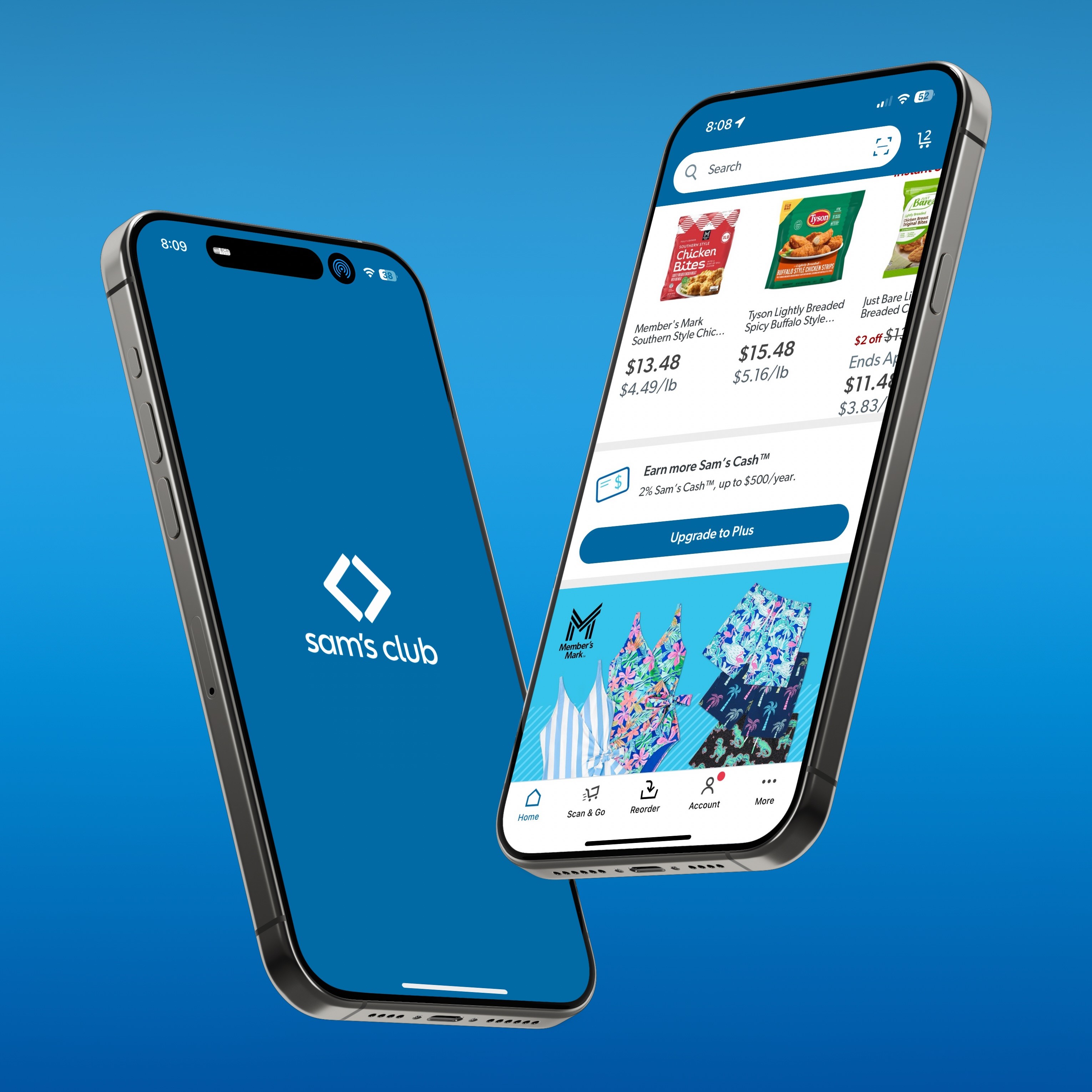
The way I approached this feature, was to break it down in steps. My first one being to just have the module appear in the right place. for this, I created a view with a button even though the button would be replaced later. Once I got the view to appear in the right place with the proper contstaints, i added the title text that was back-end driven. It wasnt until I had to fetch the image where I reached my first blocked. The image wasnt ready and i had to reach across to another team to discuss what could be done in the mean time, which in this case, was to call another image as a placeholder. The other techincal challenge was getting the membership added to the shopping cart once the button was pressed. It dealt with a part of the codebase i was not familiar with. This required me again to collaborate with other engineers. Being receptive to feedback and collaborting with others is what got this feature accross the finish line.
desc 55